
Portfolio design case study
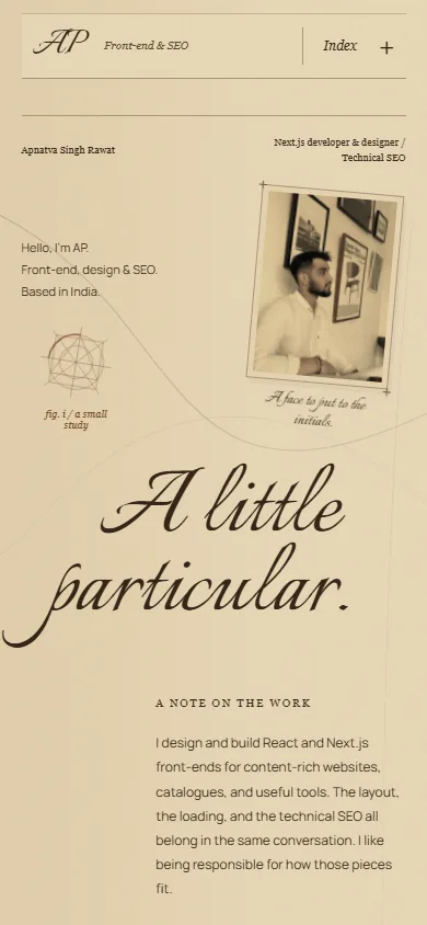
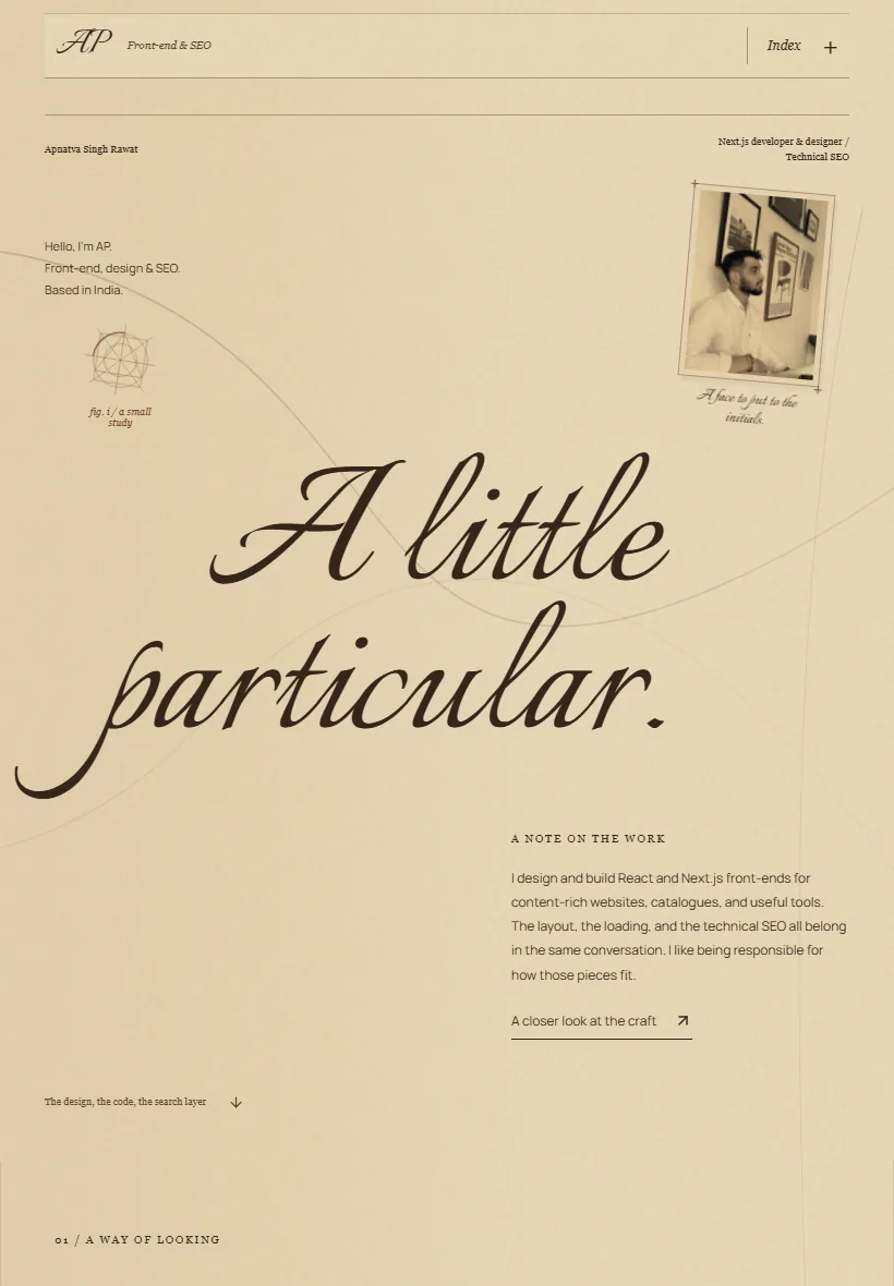
A portfolio shaped like a working notebook.
A full redesign of Apnatva Singh Rawat’s existing portfolio, bringing a distinct visual identity to his design and development work.
Visit apnatva.dev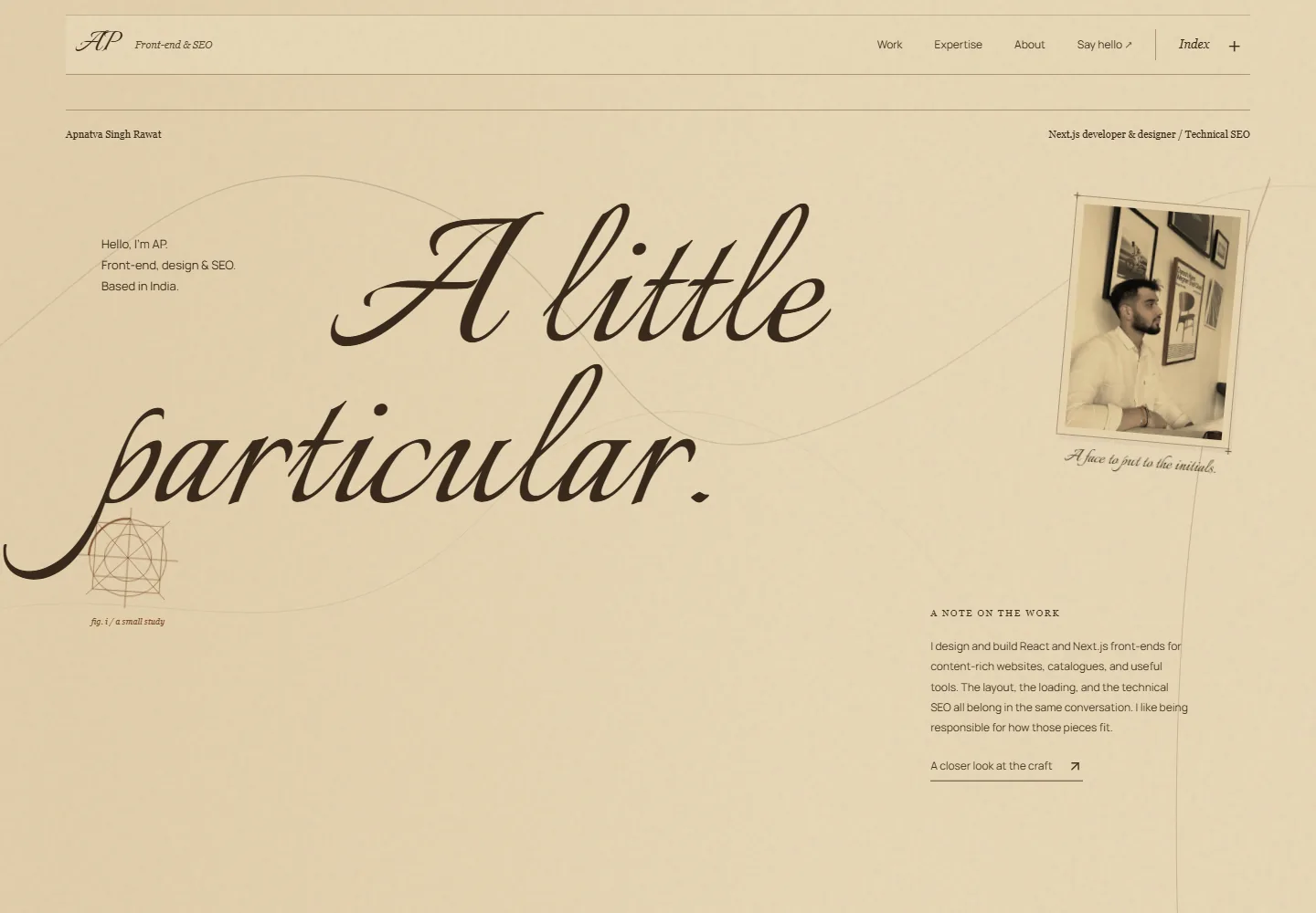
Visual direction
- What
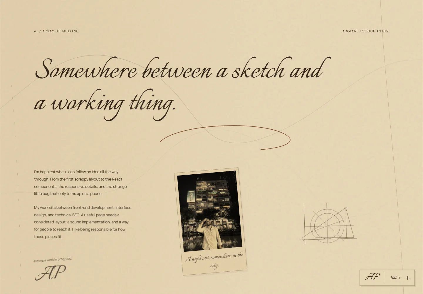
- Warm paper, brown ink, geometric drawings and mounted photographs draw on Italian Renaissance and da Vinci workbook aesthetics.
- Why
- A consistent notebook language gives the portfolio a personal identity and connects its sections.
Output
Typography
- What
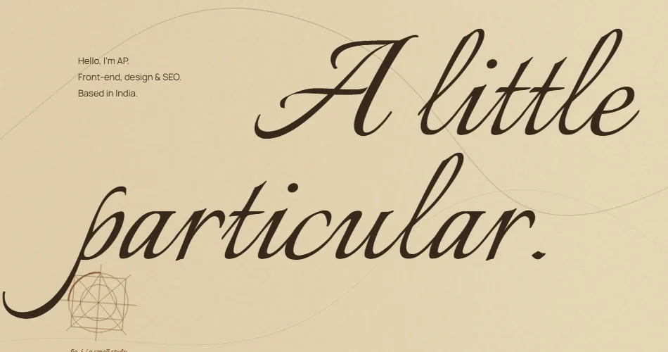
- Italianno carries the expressive headings. Manrope handles descriptions, labels and navigation.
- Why
- Separate roles give the introduction personality while keeping the practical information readable.
Output
Navigation
- What
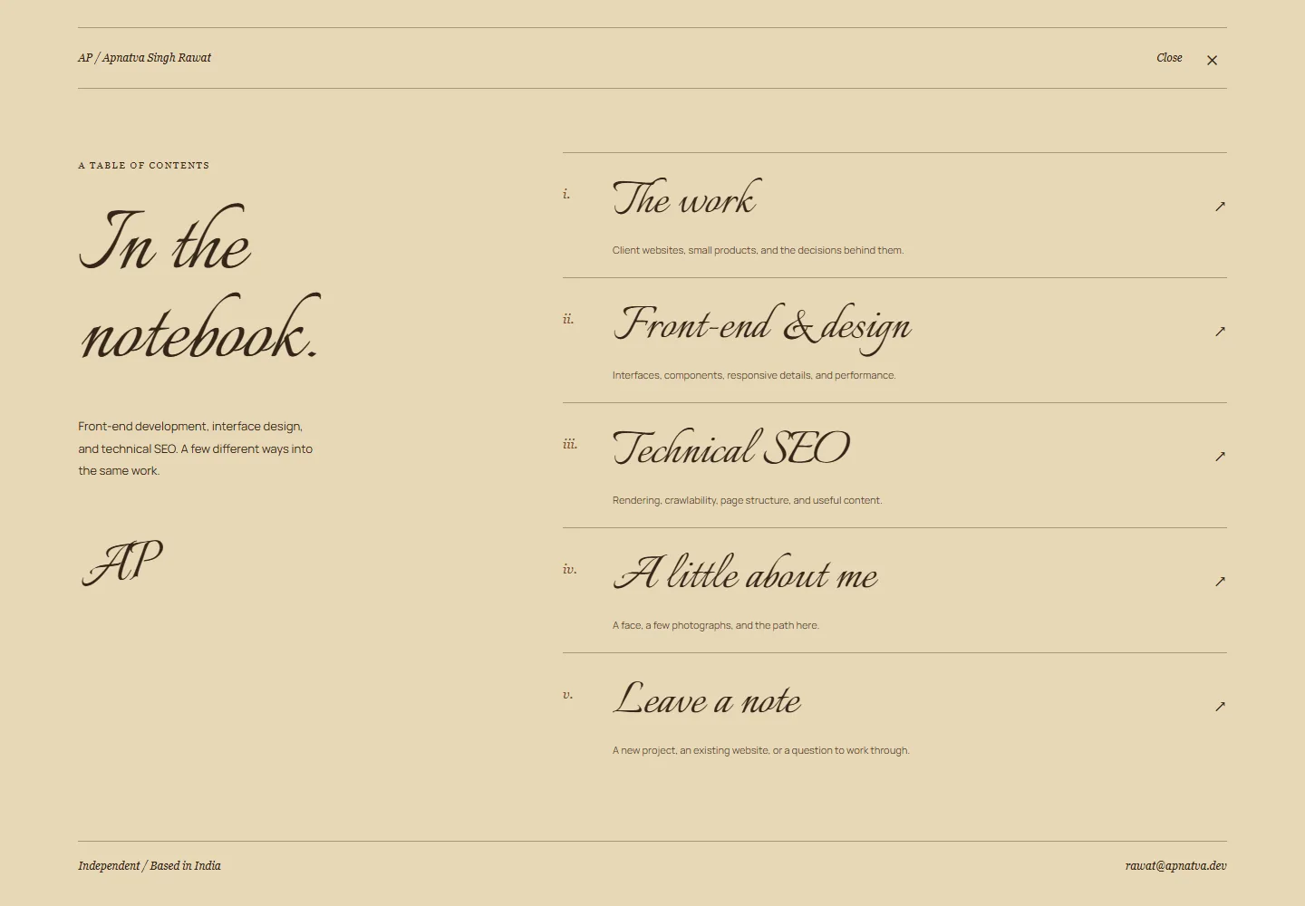
- A numbered Index links to work, front-end design, technical SEO, biography and contact.
- Why
- Visitors can reach the information they need without following the entire page.
Output
Responsive layout
- What
- The portrait, headline and notes recompose for narrower screens.
- Why
- The visual identity stays recognisable while the content follows a natural reading order.
Output
Search discovery
- What
- Descriptive page titles, canonical URLs, profile structured data and linked discipline pages establish the site’s subject.
- Why
- Clear identity and useful text help people and search systems understand the practice.
Output
A portfolio centred on front-end development and technical SEO, with direct routes to the work and contact. Ranking and enquiry results are not reported for this redesign.